

Research
Concepting
Prototyping
User Interface Design
Figma
Google Workspace
5 months
Delivered


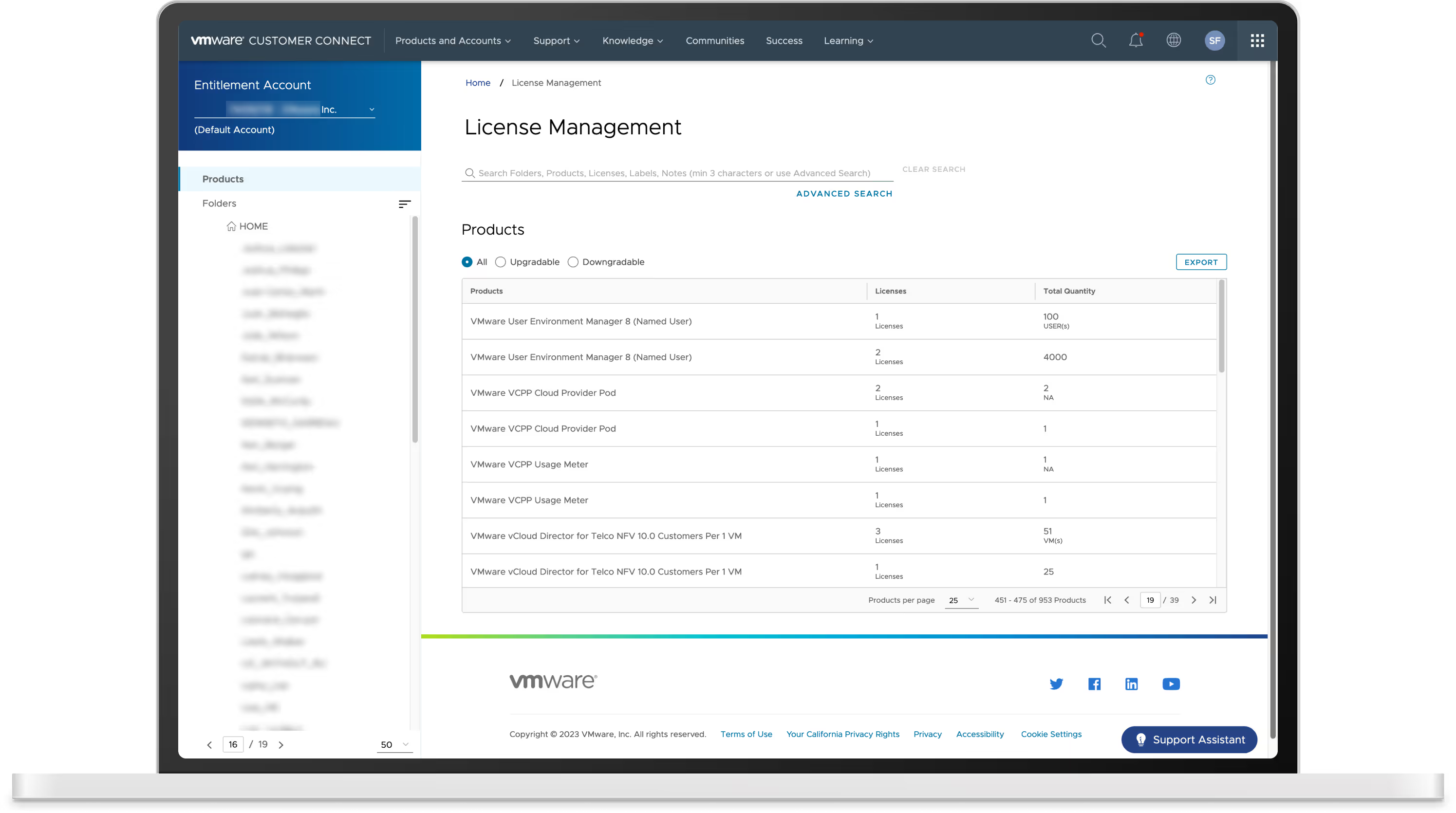
VMware’s license management tool allows customers with perpetual licenses to organize, upgrade, and edit their license keys. It is an essential part of the Customer Connect portal, ranking as the third most visited page. Despite its importance, the tool was experiencing several issues.
Over the years, customers expressed their frustrations through feedback comments, support tickets, and even spreadsheets documenting their pain points. With FullStory user session replays, we watched customers struggle with the UI, failing to complete tasks due to convoluted workflows and a lack of user-centric design.


Identify and implement research-based, low effort/high impact improvements
This was a design-driven initiative, allowing us to set our own objectives. We chose to pursue small UX wins to quickly deliver changes without getting bogged down in a months-long overhaul. We wanted to focus on fast updates that could produce measurable results like higher CSAT and lower support ticket count.
To gain a more in depth understanding of the license management tool, I leveraged our Pacesetter community for research participants. My design partner and I conducted 30-minute user interviews with 5 customers over the course of a week, learning how they engage with the current state experience.
I observed how participants performed tasks like finding and editing license keys, navigating through the folder tree system, and utilizing the search feature. Using Dovetail, we tagged and categorized recurring feedback like ease of use, challenges faced, workarounds, and frequently used features.
"It is... pretty painful to validate upgrades"
- Ian, Hosting Architect
"It's all very context-based and gets confusing very quickly"
- Brandon, Virtualization Engineer

The behavior of the tool simply didn’t meet customer assumptions of how modern applications operate.
The search function was limited in reach and produced poor results. Customers expected an omnisearch that browsed all available data within the tool.
The folder tree only showed one folder at a time and had a confusing multi-select function. Customers quickly got lost in the folder structure and had a difficult time understanding which folder content they were viewing.

Customers were unable to easily identify license keys or know which folder they were stored in. As a workaround, they exported data to CSVs or manually added notes.
They also had very different preferences for which details to provide in the data grids.

Customers struggled to find upgradable license keys. The absence of upgrade notifications forced them to rely on old purchase order emails, personal calendar alerts, and spreadsheets to stay on top of their eligible upgrades.
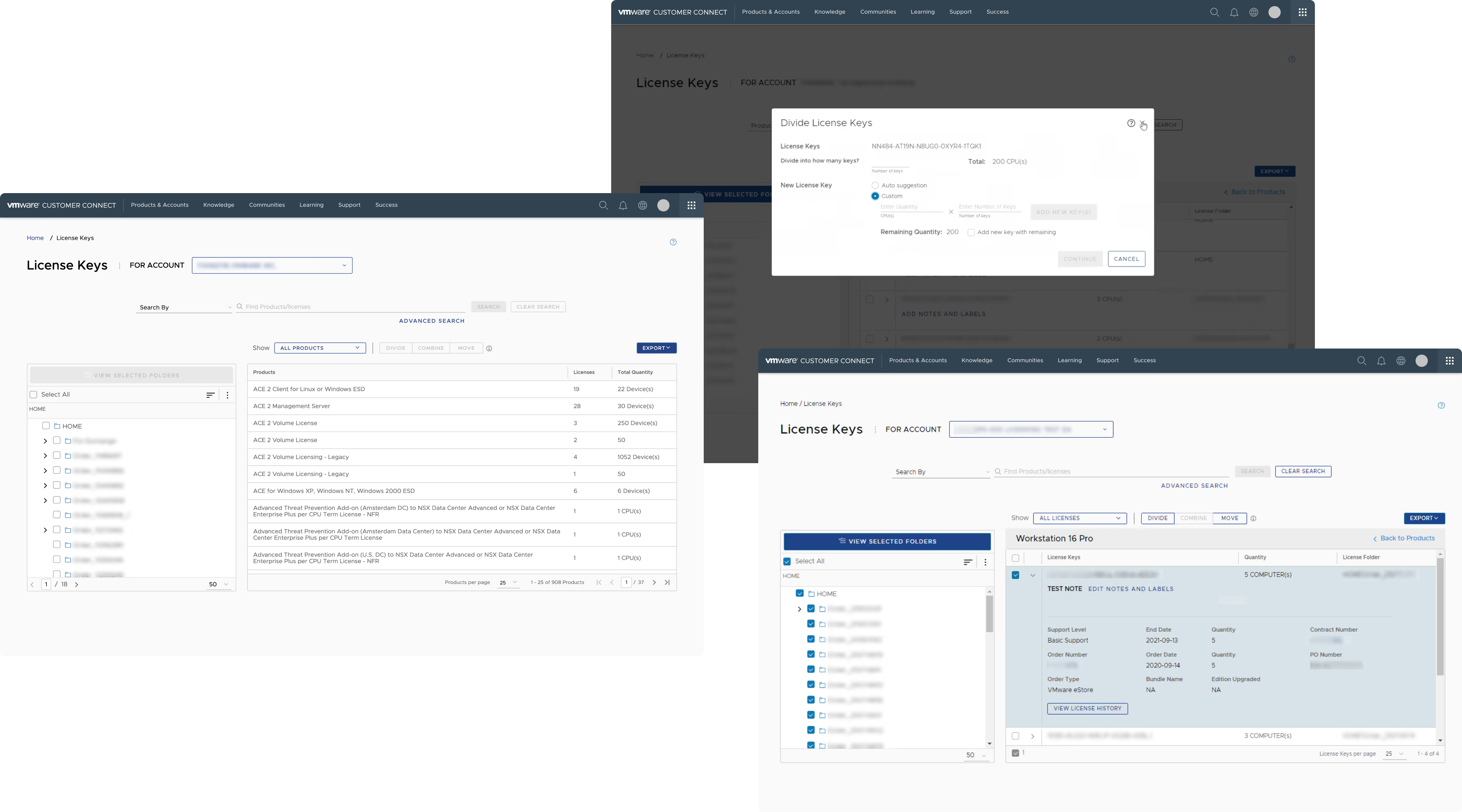
My design partner and I quickly whipped up two clickable prototypes based on our research findings. The prototypes tested out the following features:
We ran another set of 45 minute usability tests with 6 customers. At first, there was confusion from some participants on how to complete the given usability tasks. Although we had built the prototypes to exhibit more modern functionality, these users had adapted to the wonkiness of the current tool. They expected a similar experience and were using learned habits and workarounds picked up throughout the years to engage with the prototypes.
Despite the initial confusion, the prototypes were well-received, with participants completing the given prototype tasks at an 87% success rate. They found the task flows simpler and more intuitive, and appreciated having stronger context about their keys and folders.
Our two rounds of user research presented us with so many good design opportunities – too many to deliver to customers within a meaningful timeframe. In discussions with our product manager and senior leadership, we chose to push out updates in multiple phases.
For Phase One, we stayed focused on our original goal of pursuing low effort/high impact improvements, using an impact effort map to identify which changes to start with.
Over many many working sessions, my design partner and I created dozens of design proposals, testing out different layouts and combinations of our prioritized Phase One features.
Research and designs in hand, we approached our engineering partners to conduct a UX walkthrough of our design iterations and assess technical feasibility.
The reception to our design proposals was incredibly tepid and inspired some lively debate. Quite frankly, the engineering team did not want to touch license management. The aging tech stack and years of neglect already presented a challenge, and there was little appetite to add more work to their quarterly roadmap.
The customer is at fault. They should educate themselves with the technical documentation
The proposed changes aren't functionally significant enough to add to the roadmap
The changes will negatively impact performance for larger customers
Our product manager set up weekly syncs with engineering to continue discussing our designs. As lead designer on the project, my most important responsibility during these meetings was to give a voice to our customer and prioritize good UX over documentation reading. While there were many engineers, there were only two of us designers. We had to strive harder than usual to make sure we, and the customer, were heard.
Despite the difficulty, I routinely advocated for our customers, pulling specific research examples to justify design choices and to help our engineering partners empathize with their struggles.
The engineering team tested our key proposals in the CI environment. Although much of what we designed were basic features, years of accumulated tech debt made them unattainable, forcing us back to the drawing board.

Updating these functions had a negative impact on performance. Large customer accounts could experience loading times of up to four minutes – unacceptable for any web tool.
The tool's back end system could only provide plain text breadcrumbs. Clickable breadcrumbs linked to their corresponding folders was out of reach.
Customers could have hundreds of keys ready to be upgraded. Pulling them into a dashboard or dedicated section caused long loading times and even session timeouts.
We couldn't meet the customer needs exactly where they were. But could we meet them 50%, maybe 75% of the way there? More weeks of collaborative working sessions with our engineering partners helped us reach feasible compromises.
9 months after our design team initiated this project, through weeks of research, problem solving, UI tweaking, and testing, the Phase One designs were pushed into production for all customers. There was an expected spike in support requests after the launch as customers encountered the new experience. However, this began to subside after the 8 week mark. Today we continue to monitor customer feedback and session metrics as we prepare for Phase Two roadmapping.